[Case 02]
Design System
IT
Design System
Scalable & reusable conponents.
[Project Overview]
I designed a comprehensive design system to support a digital product being scaled across Web and Apple Watch platforms. The system focused on creating consistent, reusable components, improving cross-functional collaboration, and reducing design debt across teams.
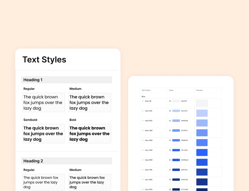
[System Architecture]
The design system followed atomic design principles and included:
Foundations:
Color palette based on accessibility and brand flexibility
Scalable typography system for readability on both large and small screens
Grid and spacing system aligned to an 8pt baseline
Icon set optimized for clarity and minimalism
Components:
Buttons (text, icon, ghost, etc.)
Input fields and form controls
Cards, alerts, status indicators
Tab bars, sliders, toggle switches
Patterns:
Data display layouts
Navigation structures for different screen sizes
Form structures and error handling patterns
Design Tokens:
Centralized values for spacing, color, radius, etc., synced to code via Tokens Studio
[Industry]
IT
[My Role]
UX/UI Designer
[Platforms]
Dekstop, Android & iOS
[Timeline]
January 2025 - May 2025
[Persona]
Scalable UI
Cross Platform Design
Component Library
UI
Visual Language
Design System
Colors: Accessible primary and secondary colors with variations for states (hover, active, disabled)
Typography: Modular font scale applied consistently across all components
Iconography: Line-based icons with uniform stroke widths and alignment
Tone: Minimal, clean, and flexible to work across various digital products
Process
[Outcome]
Key Learinings