[Case-04]

Landning Page Design For Productivity Tool

IT

Task Tiger – Landing Page Design

Customised Landing Page. Design
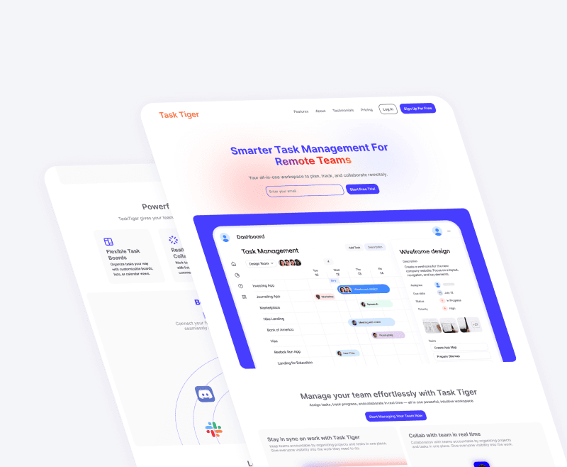
[Project Overview]

Task Tiger is a productivity tool designed to help users organize, prioritize, and track tasks effortlessly. I was responsible for designing its marketing landing page with a focus on clarity, conversion, and brand identity. The landing page was optimized for both desktop and mobile, supporting the product’s growth and onboarding strategy.

[Visual Direction]

Color Scheme: Energetic oranges and calm grays to represent motivation and clarity

  • Typography: Bold headings with high readability (using Inter and Work Sans)

  • Illustration Style: Friendly vector visuals and iconography to keep the tone approachable

  • UI Elements: Soft rounded corners, subtle shadows, and ample whitespace for a modern aesthetic

[Industry]

IT

[My Role]

UI Designer

[Platforms]

Desktop

[Timeline]

May 2025 - June 2025

[Structure & Content Statergy]

Responsive Design

UI Design

Conversion Design

Web Design

Landning Page Design

The landing page was structured around a user-driven narrative flow:

  • Hero Section:

    • Value proposition headline

    • Subtext that quickly explains the product

    • Primary CTA ("Try for Free")

  • Problem/Solution:

    • Illustrations and copy showing how Task Tiger simplifies productivity

    • Micro-interactions for feature highlight rollovers

  • Core Features:

    • Modular cards showcasing features like task grouping, reminders, and progress tracking

  • Social Proof:

    • Testimonials, star ratings, and early adopter quotes

  • Pricing & CTA:

    • Transparent pricing section

    • Repeated CTA for sign-up

  • Footer:

    • Quick links, support, branding, and terms

[Process]

[Design Process]

Started by brainstorming in figjam.

The moved to figma for wireframing and high fidelity designs.

I Used notion for organizing and brainstroming of content.

[Design Process]

Started by brainstorming in figjam.

The moved to figma for wireframing and high fidelity designs.

I Used notion for organizing and brainstroming of content.

[Design Process]

Started by brainstorming in figjam.

The moved to figma for wireframing and high fidelity designs.

I Used notion for organizing and brainstroming of content.

[Tools]

Figma: Design and prototyping

FigJam: Sitemap and content wireframing

Notion: Content and copy collaboration

[Tools]

Figma: Design and prototyping

FigJam: Sitemap and content wireframing

Notion: Content and copy collaboration

[Tools]

Figma: Design and prototyping

FigJam: Sitemap and content wireframing

Notion: Content and copy collaboration

[Testing]

Performed quick hallway usability tests to validate visual hierarchy

Iterated the hero section headline and CTA placement based on feedback

Refined illustration alignment and section padding for better mobile responsiveness

[Testing]

Performed quick hallway usability tests to validate visual hierarchy

Iterated the hero section headline and CTA placement based on feedback

Refined illustration alignment and section padding for better mobile responsiveness

[Testing]

Performed quick hallway usability tests to validate visual hierarchy

Iterated the hero section headline and CTA placement based on feedback

Refined illustration alignment and section padding for better mobile responsiveness

[Outcome & Impact]

Bounce rate decreased by 28% in the first month

Bounce rate decreased by 28% in the first month

Increased sign-up conversion rate by 17% compared to the previous page

Increased sign-up conversion rate by 17% compared to the previous page

Created a reusable section-based layout that allowed for future testing and versioning

Created a reusable section-based layout that allowed for future testing and versioning

[Key Learnings]

First impressions really matter

Users make a decision in seconds — clarity of headline and CTA placement can make or break engagement.

First impressions really matter

Users make a decision in seconds — clarity of headline and CTA placement can make or break engagement.

First impressions really matter

Users make a decision in seconds — clarity of headline and CTA placement can make or break engagement.

Conversion-led design doesn’t mean sacrificing personality

Maintaining a balance of brand tone and action-driven structure was key to trust and appeal.

Conversion-led design doesn’t mean sacrificing personality

Maintaining a balance of brand tone and action-driven structure was key to trust and appeal.

Conversion-led design doesn’t mean sacrificing personality

Maintaining a balance of brand tone and action-driven structure was key to trust and appeal.

Collaboration sharpens the message

Working closely with content writers and marketers ensured that visual design and messaging worked together, not in silos.

Collaboration sharpens the message

Working closely with content writers and marketers ensured that visual design and messaging worked together, not in silos.

Collaboration sharpens the message

Working closely with content writers and marketers ensured that visual design and messaging worked together, not in silos.

Select this text to see the highlight effect